Time-Series Analysis: What Is It and How to Use It

What Is Time-Series Analysis?
Time-series analysis is a statistical technique that deals with time-series data or trend analysis. It involves the identification of patterns, trends, seasonality, and irregularities in the data observed over different periods. This method is particularly useful for understanding the underlying structure and pattern of the data.
When performing time-series analysis, you will use a mathematical set of tools to look into time-series data and learn not only what happened but also when and why it happened.
Time-series analysis vs. time-series forecasting
While both time-series analysis and time-series forecasting are powerful tools that developers can harness to glean insights from data over time, they each have specific strengths, limitations, and applications.
Time-series analysis isn't about predicting the future; instead, it's about understanding the past. It allows developers to decompose data into its constituent parts—trend, seasonality, and residual components. This can help identify any anomalies or shifts in the pattern over time.
Key methodologies
Key methodologies used in time-series analysis include moving averages, exponential smoothing, and decomposition methods. Methods such as Autoregressive Integrated Moving Average (ARIMA) models also fall under this category—but more on that later.
On the other hand, time-series forecasting uses historical data to predict future events. The objective here is to build a model that captures the underlying patterns and structures in the time-series data to predict future values of the series.
Checklist for Time-Series Analysis
When analyzing time-series data, a structured approach not only simplifies the process but also enhances the accuracy and relevance of your outcomes. Below is a comprehensive checklist to guide your analysis, ensuring that no critical component is overlooked.
Look for trends: At the heart of time series analysis is the identification of trends over a period, typically through rolling aggregates that smooth out short-term fluctuations to reveal a long-term trend.
Check for seasonality: Seasonality captures the repetitive and cyclical patterns in your data, occurring at regular intervals. Identifying these patterns is vital as they offer insights into predictable changes. Integrating your contextual knowledge about the dataset can greatly aid in making sense of these seasonal behaviors.
Once you've identified the trends and seasonality within your data, the next step is to construct a model that combines these elements. This model should roughly match the underlying data, providing a more accurate representation of the observed behaviors.
Attempt a model of remaining noise: After accounting for trend and seasonality, the “noise” remains—the part of the data not explained by the model. Analyze this noise by taking your data modulo trend and seasonality to inspect its behavior. Ideally, it should exhibit a stationary distribution, meaning it appears somewhat chaotic but has a stable average and variance over time.
With a stationary noise distribution, you can apply statistical heuristics, such as calculating the average and variance, to make future projections. These estimates can serve as a basis for more complex forecasting. For a more detailed analysis, you might explore stochastic models like Brownian motion. These models account for randomness and can provide more nuanced insights into how your time series data might evolve.
Integrating your understanding of the data’s context is crucial throughout each step of your analysis. Whether industry-specific knowledge or familiarity with specific patterns, this insight will help refine your models and projections, leading to more accurate and meaningful models.
Use Cases for Time-Series Analysis
The “time” element in time-series data means that the data is ordered by time. Time series data refers to a sequence of data points or observations recorded at specific intervals. This data type is commonly used to analyze trends, patterns, and behaviors over time. Check out our earlier blog post to learn more and see examples of time-series data.
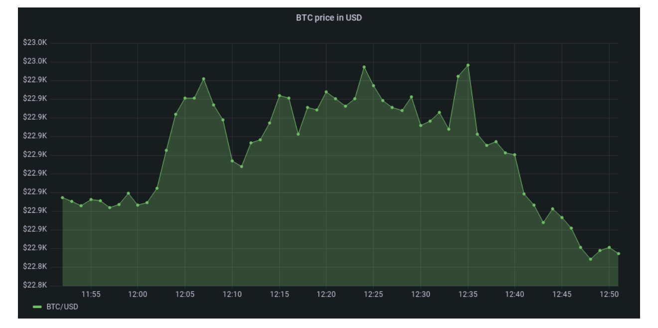
A typical example of time-series data is stock prices or a stock market index. However, even if you’re not into financial and algorithmic trading, you probably interact daily with time-series data.
Here are some other examples of time-series data for time-series analysis:
- IoT and sensor data: Monitoring and analyzing sensor data from devices, machinery, or infrastructure to predict maintenance needs, optimize performance, and detect anomalies.
- Weather forecasting: Utilizing historical weather data to forecast future meteorological conditions, such as temperature, precipitation, and wind patterns.
- E-commerce and retail: Tracking sales data over time to identify seasonal trends, forecast demand, and optimize inventory management and pricing strategies.
- Healthcare: Analyzing patient vital signs, medical records, and treatment outcomes to improve healthcare delivery, disease surveillance, and patient care.
- Energy consumption: Studying electricity or energy usage patterns to optimize consumption, forecast demand, and support energy efficiency initiatives.
- Manufacturing and supply chain: Monitoring production processes, inventory levels, and supply chain data to enhance operational efficiency and demand forecasting.
- Web traffic and user behavior: Analyzing website traffic, user engagement metrics, and customer behavior patterns to enhance digital marketing strategies and user experience.
As you can see, time-series data is part of many of your daily interactions, whether you're driving your car through a digital toll, receiving smartphone notifications about the weather forecast, or suggesting you should walk more. If you're working with observability, monitoring different systems to track their performance and ensure they run smoothly, you're also working with time-series data. And if you have a website where you track customer or user interactions (event data), guess what? You're also a time-series analysis use case.
To illustrate this in more detail, let’s look at the example of health apps—we'll refer back to this example throughout this blog post.
A Real-World Example of Time-Series Analysis
If you open a health app on your phone, you will see all sorts of categories, from step count to noise level or heart rate. By clicking “show all data” in any of these categories, you will get an almost endless scroll (depending on when you bought the phone) of step counts, timestamped with the sampling time.

This data is the raw foundation of the step count time series. Remember, this is just one of many parameters your smartphone or smartwatch samples. While many parameters don’t mean much to most people (yes, I’m looking at you, heart rate variability), when combined with other data, these parameters can estimate overall quantifiers, such as cardio fitness.
To achieve this, you need to connect the time-series data into one large dataset with two identifying variables—time and type of measurement. This is called panel data. Separating it by type gives you multiple time series, while picking one particular point in time gives you a snapshot of everything about your health at a specific moment, like what was happening at 7:45 a.m.
Why Should You Use Time-Series Analysis?
Now that you’re more familiar with time-series data, you may wonder what to do with it and why you should care. So far, we’ve mostly just been reading off data—how many steps did I take yesterday? Is my heart rate okay?
But time-series analysis can help us answer more complex or future-related questions, such as forecasting. When did I stop walking and catch the bus yesterday? Is exercise making my heart stronger?
To answer these, we need more than just reading the step counter at 7:45 a.m.—we need time-series analysis. Time-series analysis happens when we consider part or the entire time series to see the “bigger picture.” We can do this manually in straightforward cases: for example, by looking at the graph that shows the days when you took more than 10,000 steps this month.
But if you wanted to know how often this occurs or on which days, that would be significantly more tedious to do by hand. Very quickly, we bump into problems that are too complex to tackle without using a computer, and once we have opened that door, a seemingly endless stream of opportunities emerges. We can analyze everything, from ourselves to our business, and make them far more efficient and productive than ever.
The four components of time-series analysis
To correctly analyze time-series data, we need to look at the four components of a time series:
- Trend: this is a long-term movement of the time series, such as the decreasing average heart rate of workouts as a person gets fitter.
- Seasonality: regular periodic occurrences within a time interval smaller than a year (e.g., higher step count in spring and autumn because it’s not too cold or too hot for long walks).
- Cyclicity: repeated fluctuations happened that are longer in duration than irregularities but shorter than what would constitute a trend. In our walking example, this would be a one-week sightseeing holiday every four to five months.
- Irregularity: short-term irregular fluctuations or noise, such as a gap in the sampling of the pedometer or an active team-building day during the workweek.

Let’s go back to our health app example. One thing you may see immediately, just by looking at a time-series analysis chart, is whether your stats are trending upward or downward. That indicates whether your stats are generally improving or not. By ignoring the short-term variations, it's easier to see if the values rise or decline within a given time range. This is the first of the four components of a time series—trend.
Types of Time-Series Analysis
Time to dive deeper into how time-series analysis can extract information from time-series data. To do this, let’s divide time-series analysis into five distinct types.
Exploratory analysis
Exploratory analysis is helpful when describing what you see and explaining why you see it in a given time series. It essentially entails decomposing the data into trend, seasonality, cyclicity, and irregularities.
Once we decompose the series, we can explain what each component represents in the real world and, perhaps, what caused it. This task is not as easy as it may seem and often involves spectral decomposition to find any specific frequencies of recurrences and autocorrelation analysis to see if current values depend on past values.
Curve fitting
Since time series is a discrete set, you can always tell exactly how many data points it contains. But what if you want to know the value of your time-series parameter at a point in time that is not covered by your data?
To answer this question, we must supplement our data with a continuous set—a curve. You can do this in several ways, including interpolation and regression. The former is an exact match for parts of the given time series and is primarily useful for estimating missing data points. On the other hand, the latter is a “best-fit” curve, where you have to make an educated guess about the form of the function to be fitted (e.g., linear) and then vary the parameters until your best-fit criteria are satisfied.
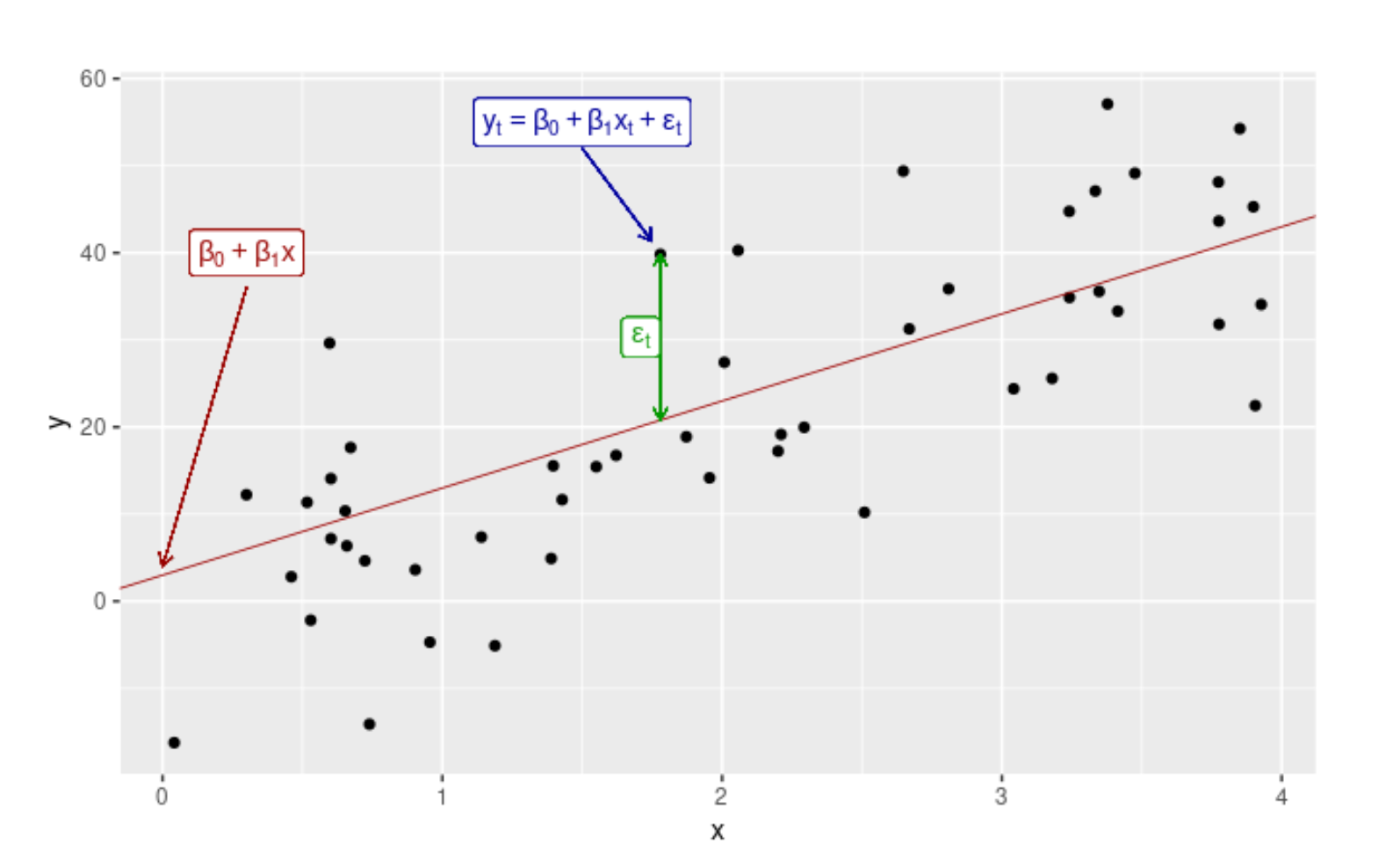
What constitutes a “best-fit” situation depends on the desired outcome and problem. Using regression analysis, you also obtain the best-fit function parameters that can have real-world meaning, for example, post-run heart rate recovery as an exponential decay fit parameter. In regression, we get a function that describes the best fit to our data even beyond the last record opening the door to extrapolation predictions.
Forecasting
Statistical inference is the process of generalization from sample to whole. It can be done over time in time-series data, giving way to future predictions or forecasting: from extrapolating regression models to more advanced techniques using stochastic simulations and machine learning. If you want to know more, check out our article about time-series forecasting.
Classification and segmentation
Time-series classification is identifying the categories or classes of an outcome variable based on time-series data. In other words, it's about associating each time-series data with one label or class.
For instance, you might use time-series classification to categorize server performance into 'Normal' or 'Abnormal' based on CPU usage data collected over time. The goal is to create a model to accurately predict the class of new, unseen time-series data.
Classification models commonly used include decision trees, nearest neighbor classifiers, and deep learning models. These models can handle the temporal dependencies in time-series data, making them ideal for this task.
Time-series segmentation, on the other hand, involves breaking down a time series into segments, each representing a specific event or state. The objective is to simplify the time-series data by representing it as a sequence of more manageable segments.
For example, in analyzing website traffic data, you might segment the data into periods of 'High,' 'Medium,' and 'Low' activity. This segmentation can provide simpler, more interpretable insights into your data.
Segmentation methods can be either top-down, where the entire series is divided into segments, or bottom-up, where individual data points are merged into segments. Each method has its strengths and weaknesses, and the choice depends on the nature of your data and your specific requirements.
As you may have already guessed, problems rarely require just one type of analysis. Still, it is crucial to understand the various types to appreciate each aspect of the problem correctly and formulate a good strategy for addressing it.
Time-Series Analysis Visualization and Examples
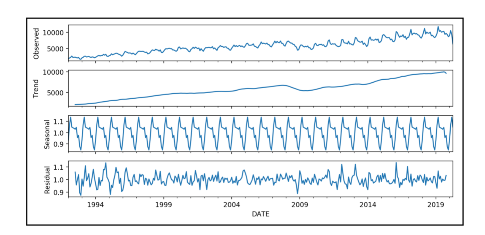
There are many ways to visualize a time series and certain types of analysis. A run chart is the most common choice for simple time series with one parameter, essentially just data points connected by lines.
However, there are usually several parameters you would like to visualize at once. You have two options in this case: overlapping or separated charts. Overlapping charts display multiple series on a single pane, whereas separated charts show individual series in smaller, stacked, and aligned charts, as seen below.


Let’s take a look at three different real-world examples illustrating what we’ve learned so far. To keep things simple and best demonstrate the analysis types, the following examples will be single-parameter series visualized by run charts.
Electricity demand in Australia
Stepping away from our health theme, let's explore the time series of Australian monthly electricity demand in the figures below. Visually, it is immediately apparent there is a positive trend, as one would expect with population growth and technological advancement.
Second, the data has a pronounced seasonality, as demand in winter will not be the same as in summer. An autocorrelation analysis can help us understand this better. Fundamentally, this checks the correlation between two points separated by a time delay or lag.
As we can see in the autocorrelation function (ACF) graph, the highest correlation occurs with a delay of exactly 12 months (implying a yearly seasonality) and the lowest with a half-year separation since electricity consumption is highly dependent on the time of year (air conditioning, daylight hours, etc.).
Since the underlying data has a trend (it isn’t stationary), the ACF dies down as the lag increases since the two points are further and further apart, with the positive trend separating them more each year. These conclusions can become increasingly non-trivial when data spans less intuitive variables.


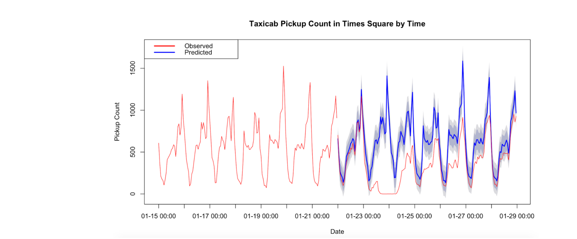
Boston Marathon winning times
Back to our health theme from the more exploratory previous example, let’s look at the winning times of the Boston Marathon. The aim here is different: we don’t particularly care why the winning times are such. We want to know whether they have been trending and where we can expect them to go.
To do this, we need to fit a curve and assess its predictions. But how do you know which curve to choose? There is no universal answer to this; however, even visually, you can eliminate a lot of options. The figure below shows you four different choices of fitted curves:
1. A linear fit
f(t) = at + b
2. A piecewise linear fit, which is just several linear fit segments spliced together
3. An exponential fit
f(t) = aebt + c
4. A cubic spline fit that’s like a piecewise linear fit where the segments are cubic polynomials with smooth joins
f(t) = at3 + bt2 + ct + d
Looking at the graph, it’s clear that the linear and exponential options aren’t a good fit. It boils down to the cubic spline and the piecewise linear fits. In fact, both are useful, although for different questions.
The cubic spline is visually the best historical fit, but in the future (purple section), it trends upward in an intuitively unrealistic way, with the piecewise linear producing a far more reasonable prediction. Therefore, one has to be very careful when using good historical fits for prediction; understanding the underlying data is extremely important when choosing forecasting models.

Electrocardiogram analysis
As a final example to illustrate the classification and segmentation types of problems, take a look at the following graph. Imagine wanting to train a machine to recognize certain heart irregularities from electrocardiogram (ECG) readings.
First, this is a segmentation problem, as you need to split each ECG time series into sequences corresponding to one heartbeat cycle. The dashed red lines in the diagram are the splittings of these cycles. Having done this on both regular and irregular readings, this becomes a classification problem—the algorithm should now analyze other ECG readouts and search for patterns corresponding to either a regular or irregular heartbeat.

Learn More About Time-Series Analysis
This was just a glimpse of what time-series analysis offers. By now, you should know that time-series data is ubiquitous. To measure the constant change around you for added efficiency and productivity (whether in life or business), you need to go for it and start analyzing it.
I hope this article has piqued your interest, but nothing compares to trying it out yourself. And for that, you need a robust database to handle the massive time-series datasets. Try Timescale, a modern, cloud-native relational database platform for time series that will give you reliability, fast queries, and the ability to scale infinitely to understand better what is changing, why, and when.
Continue your time-series journey:
- What Is Time-Series Data? (With Examples)
- What Is Time-Series Forecasting?
- Time-Series Database: An Explainer
- A Guide on Data Analysis on PostgreSQL
- What Is a Time-Series Graph With Examples
- What Is a Time-Series Plot, and How Can You Create One
- Get Started With TimescaleDB With Our Tutorials
- How to Write Better Queries for Time-Series Data Analysis With Custom SQL Functions
- Speeding Up Data Analysis With TimescaleDB and PostgreSQL