What Is a Time-Series Plot, and How Can You Create One?
Have you ever marveled at what the future holds? Whether you are developing a crypto trading platform, collecting data from IoT devices to measure energy consumption, or working on an application to forecast sales, a time-series plot is an indispensable tool for predicting the future. It helps uncover hidden patterns in your data so that you can gain insights into trends, cycles, and fluctuations over time.
In this article, we will take a deep dive into time-series plots, exploring what they are and how you can use them to extract valuable information from your data. Understanding how to create and interpret time-series plots is essential as they help us make better decisions and stay ahead of the competition. Let’s get started.
What Is a Time-Series Plot?
A time-series plot, also known as a time plot, is a type of graph that displays data points collected in a time sequence. In a time-series plot, the x-axis represents the time, and the y-axis represents the variable being measured. We use time plots in many fields, such as economics, finance, engineering, and meteorology, to visualize and analyze changes over time.
Examples of time-series plots
Time-series plots allow you to see trends and patterns in data that might not be visible in other types of graphs. For instance, you can see how a particular variable changes over months, seasons, years, or even decades. This way, you can identify seasonal fluctuations, long-term trends, and cyclic patterns in data.
Here are some examples of time plots.
Website traffic over time
Let's say you want to analyze the traffic to your website over the past year. You can create a time-series plot of the daily or monthly website visits, with the x-axis representing time and the y-axis representing the number of visits. Here's an example time plot of the monthly website traffic to a fictional website over the past year:

The data shows a higher traffic pattern during the year's middle months, with the peak in traffic occurring in August. The traffic then gradually declines towards the end of the year, with a sharp decrease in traffic during the last two months. The graph also shows some fluctuations in traffic, but overall the trend is a seasonal pattern of higher traffic during the summer months.
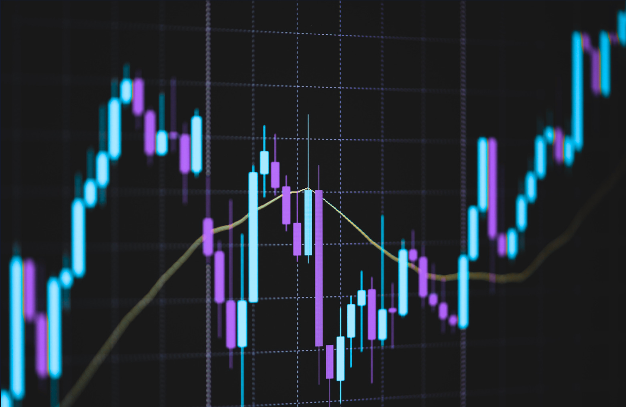
Stock prices over time
Let's say you want to visualize the stock prices of a particular company over the past year. You can create a time-series plot of the daily closing prices of the stock, with the x-axis representing time (in days) and the y-axis representing the stock's closing price. Here's an example time-series plot of the daily closing prices of Apple Inc. stock (AAPL) over the past year:

By analyzing the plot, we can see that there are periods of both upward and downward trends in the stock price. The fluctuations in the stock price over time may be due to a variety of factors, such as changes in market conditions, company financial performance, or industry trends.
Understanding time-series data
Time-series data is a type of data collected at regular intervals over time. One of the most significant features of time-series data is its sequential nature. It means that each data point is dependent on the one that came before it. You can visualize this dependency via a time plot that displays data points collected in a time sequence.
The two previously mentioned examples—website traffic and stock prices over time—are time-series data use cases. We can collect website traffic data using tools such as Google Analytics and analyze it to identify trends in user behavior over time. A time plot with time on x-axis and the number of website visitors on y-axis can be used to visualize this data.
Regarding stock prices, we can also collect them at regular intervals i.e., daily, hourly, or every minute to identify trends over time. A time plot with time on x-axis and the stock price on y-axis can be used to visualize this data.
Another great example would be temperature readings over time. We can take temperature readings at regular intervals to identify patterns in temperature changes over time. A time plot with time on x-axis and temperature on y-axis can be used to visualize this data.
Variable Types for Time-Series Plots
When plotting a time-series chart, it is important to consider the type of variable you are plotting. Generally, time-series data can be divided into two types of variables, i.e., quantitative and qualitative.
Quantitative variables have numerical values and can be quantified/measured on a discrete or continuous scale. For instance, temperature readings, stock prices, and website traffic data are quantitative variables. They are typically plotted on the y-axis of a time-series chart, with time on the x-axis.
Let’s consider an example of time-series data for a retail store to understand the difference between quantitative and qualitative variables. The store collects daily sales data for three different products: Product A, Product B, and Product C. The sales data for each product represents a quantitative variable, as it has a numerical value that can be plotted on a time-series plot. The following example illustrates a time-series plot for the sales data:

As evident from the plot, the sales data of each product is plotted on the y-axis, with time on the x-axis. This plot allows us to visualize trends and patterns in the sales data over time for each product.
Qualitative variables, on the other hand, have categorical or non-numerical values. For instance, a website’s name, the type of product sold, or the region where a company operates are qualitative variables. Typically, they are not plotted on a time-series chart as they do not have a numerical value that can be represented on a continuous scale. However, we can use them to categorize/group the data for analysis.
Let's consider an example of qualitative data for the same retail store. The store collects data on the region where each sale was made, including North, South, East, and West. This data can be represented as a qualitative variable on a time-series plot. Below is an example of how we can visualize the sales data by region using a bar chart:

As evident from the chart, the sales data for each region is represented as a separate bar, with the height of each bar indicating the total sales for that region over time. This chart helps us compare sales data for each area and identify any patterns/trends that may be present.
How to Interpret a Time-Series Plot?
To interpret a time-series plot, you must understand the data patterns over time. These are the key factors to consider when interpreting a time-series plot:
- Seasonality: It refers to recurring patterns/cycles that occur over a particular period. The patterns can be weekly, monthly, quarterly, or annual. For instance, winter coat sales typically show a seasonal pattern as they increase in the fall and winter and decrease in the spring and summer.
- Trend: It refers to the general direction the data moves in over time. A trend can either be upward, downward or remain constant. A positive trend indicates that the values are increasing over time, while a negative trend shows the values are decreasing over time. A horizontal trend suggests that the values remain constant over time.
- Outliers: They refer to values that lie outside the usual pattern of the data. External factors or random events can cause outliers and can significantly impact the interpretation of the time-series plot.
- Level: It refers to the average data value over the entire time period in a time-series plot. A higher level indicates that the values are higher overall and vice versa.

By interpreting the graph, we can see that the trend is negative. The values appear to be decreasing overall from left to right, indicating that the underlying process generating the data might be in decline over time.
What Are Time-Series Graphs?
A time-series graph displays data that changes over time. Typically, it has time on the x-axis and the variable of interest on the y-axis.
Time-series graphs can visualize the stock market prices over some time. The graph below shows the daily closing prices of Apple stock over one year, from January 2022 to May 2022.

The x-axis represents the date, and the y-axis represents the stock price in US dollars. The graph shows an increasing trend in the stock price for the first few months, followed by a slight decline towards the end of the time period.
Check our blog post to learn more and see examples of time-series graphs.
Time-Series Plot vs. Time-Series Graphs
The terms "time-series plot" and "time-series graph" are often used interchangeably to refer to the graphical representation of a time-series dataset.
Remember that if you have lines in a grid (that can be shown or not), you have a graph. If you have points, it’s a plot. So, a time plot clearly highlights individual data points and their values. A time-series graph, on the other hand, refers to a continuous line or curve that connects the data points and helps understand the overall trend in the data.
The following table compares time-series plots and the time-series graphs.
| Time-Series Plot | Time-Series Graph |
|---|---|
| It typically plots the value of a single variable against time. | It can display multiple variables over time. |
| It displays data as a line or scatter plot. | It can display data using various visualizations, including line graphs, scatter plots, heat maps, etc. |
| It is best suited for analyzing trends and patterns in data over time. | It is best suited for visualizing the behavior of a system over time. |
| All time-series plots can be considered graphs that display numerical data in a visual format. | Not all time-series graphs can be considered plots, as they can represent various types of data. |
| It is used in statistical analysis and forecasting. | It is used in fields such as engineering, physics, and biology to study systems and processes over time. |
| It is often used to compare different time periods or show changes over time. | It is used to identify correlations between variables and analyze system behavior. |
How to Create a Time-Series Plot?
You can plot time-series data via various tools such as Excel, Python, and SQL as shown below.
Plotting time-series data in Excel
- Open Microsoft Excel and create a new workbook.
- Enter the data you want to plot in the worksheet, with time in one column and the corresponding data in the adjacent column.
- Select the data range you want to plot, including both the time and data columns.
- Go to the “Insert” tab and select the “Line” chart type. Select the type of line chart you want to use from the dropdown menu.
- You will see the chart with the selected data on the worksheet. Using the “Chart Design” and “Format” tabs, you can customize the chart by adding axes labels, titles, and other features.
- You can save the workbook or export the chart as a separate image file once the chart is complete.
Plotting time-series data in Python
- Import the necessary libraries, such as pandas and matplotlib.
- Load the time-series data into a pandas dataframe or generate sample data using NumPy and pandas to create a time series of random values.
- Create a plot using the matplotlib library. Specify the time column as the x-axis and the value column as the y-axis.
- Add a title and axis labels to the plot as desired.
- Display the plot using matplotlib library.
Below is the example Python code that creates a time series of random values with a daily frequency from January 1, 2022, to May 1, 2022.
import pandas as pd
import matplotlib.pyplot as plt
import numpy as np

# Generate some sample data
date_range = pd.date_range('2022-01-01', '2022-05-01', freq='D')
values = np.random.randn(len(date_range)).cumsum()
data = {'date_column': date_range, 'value_column': values}
df = pd.DataFrame(data)

# Create the plot
plt.plot(df['date_column'], df['value_column'], linestyle = 'dotted')

# Add title and axis labels
plt.title('Time Series Plot')
plt.xlabel('Time')
plt.ylabel('Value')
plt.xticks(rotation=45)

# Display the plot
plt.show()

Plotting time-series data in SQL
You can plot time-series data in SQL using Timescale. Use the TimescaleDB toolset that provides several functions for working with time-series data—it will make your work simpler and faster. In this blog post, we explain more reasons why you should use SQL for time-series analysis.
Follow the steps below to plot time-series data in SQL using Timescale:
- Install the Timescale extension for PostgreSQL. You can follow the installation instructions provided in the Timescale documentation.
- Use the Timescale functions to plot time-series data in SQL. For instance, you can use the Timescale function
time_bucket()to group the data into time intervals and then use theavg()function to calculate the average value for each interval.
The following SQL query plots the average temperature for each hour in the last 96 hours:
SELECT time_bucket('1 hour', time) as hour, avg(temperature) as avg_temp
FROM temperature_data
WHERE time > NOW() - INTERVAL '96 hours'
GROUP BY hour
ORDER BY hour;
In this query, time_bucket() groups the temperature data into one-hour intervals, avg() calculates the average temperature for each interval, and WHERE filters the data to the last 96 hours.
3. You can then use a data visualization tool like Grafana to display the query results as a time-series graph. Check out our tutorial on how to plot time-series graphs with Grafana and Timescale.

Types of Time-Series Plots for Data Visualization
Visualizing time-series data is an important step in understanding the trends and anomalies in data. Below are the various types of time-series plots that we can use to visualize time-series data.
Line plots
A line plot is the simplest and the most commonly used plot for visualizing time-series data. It represents a series of data points connected by a straight line, with the x-axis representing time and the y-axis representing the data value.
Here is an example line plot created using Python’s matplotlib library.
import matplotlib.pyplot as plt
import numpy as np

# Create some sample data
x = np.arange('2022-01-01', '2022-01-31', dtype='datetime64[D]')
y = np.random.randint(0, 100, size=len(x))

# Create the line plot
plt.plot(x, y, linestyle = 'dotted')

# Add title and axis labels
plt.title('Line Plot Example')
plt.xlabel('Date')
plt.ylabel('Value')
plt.xticks(rotation=45)

# Display the plot
plt.show()

Histograms and density plots
Histograms and density plots are helpful to visualize the distribution of data values in a time series. A density plot is a smooth curve that shows the distribution of data in a continuous manner, while a histogram is made up of bars that touch each other. Density plots show the probability density function of the data values, while histograms show counts (frequency of values in different ranges).
See the below plots created using Seaborn in Python.
import seaborn as sns
import numpy as np

# Create some sample data
x = np.random.normal(size=1000)

# Create the histogram
sns.histplot(x, kde=False)

# Add title and axis labels
plt.title('Histogram Example')
plt.xlabel('Value')
plt.ylabel('Frequency')

# Display the plot
plt.show()

# Create the density plot
sns.kdeplot(x, linestyle = 'dotted')

# Add title and axis labels
plt.title('Density Plot Example')
plt.xlabel('Value')
plt.ylabel('Density')

# Display the plot
plt.show()

Box and whisker plots
A box and whisker plot, also known as a boxplot, is used to visualize the distribution of values in a time series and identify outliers. Box plots show the quartiles of the data, with the box representing the interquartile range (IQR) and the whiskers representing the range of the data. The points outside the whiskers represent the outliers.
See the below boxplot created using Seaborn in Python.
import seaborn as sns
import numpy as np

# Create some sample data
x = np.random.normal(size=1000)

# Create the boxplot
sns.boxplot(x)

# Add title and axis labels
plt.title('Boxplot Example')
plt.xlabel('Value')

# Display the plot
plt.show()

Heat maps
A heat map is used to visualize the relationship between two variables in a time series. Heat maps represent the values of the two variables as colors in a grid, with the x-axis representing one variable and the y-axis representing the other.
See the below heat map created using Seaborn in Python:
import pandas as pd
import numpy as np
import seaborn as sns
import matplotlib.pyplot as plt

np.random.seed(0)
sns.set()
uniform_data = np.random.rand(10, 12)
ax = sns.heatmap(uniform_data, vmin=0, vmax=1)
# Add title and axis labels
plt.title('Heat Map Example')
plt.show()

Lag plots or scatter plots
Lag plots, also known as scatter plots, determine whether a time series is random or not. They plot the value of a time series against its lagged value (the value of the series at the previous time point). The time series is likely to be random if the points in the scatter plot are randomly scattered.
Here is an example lag plot created using Python:
import pandas as pd
import matplotlib.pyplot as plt

# Create sample data
data = pd.Series([1, 2, 3, 4, 5, 6, 7, 8, 9, 10])

# Create lag plot
pd.plotting.lag_plot(data)

# Display the plot
plt.title('Example Lag Plot')
plt.show()

Autocorrelation plots
Autocorrelation plots, also known as ACF plots, determine the level of autocorrelation in a time series. They plot the autocorrelation coefficient of a time series against its lagged value.
The autocorrelation coefficient measures the strength of the linear relationship between the time series values at different time lags. If it is close to 1 or -1, then the time series exhibits a strong positive or negative autocorrelation, respectively. If it is close to 0, then the time series exhibits little or no autocorrelation.
Here is an example autocorrelation plot created using Python.
import pandas as pd
import matplotlib.pyplot as plt

# Create sample data
data = pd.Series([1, 2, 3, 4, 5, 6, 7, 8, 9, 10])

# Create autocorrelation plot
pd.plotting.autocorrelation_plot(data, linestyle = 'dotted')

# Display the plot
plt.title('Example Autocorrelation Plot')
plt.show()

Leveraging Data Analysis for Time-Series Forecasting
Data analysis is a crucial step in time-series forecasting, as it allows analysts to identify trends/patterns in data and make informed decisions. For instance, if weather data shows a seasonal pattern, this information can be used to predict future weather patterns and plan accordingly. Likewise, if historical sales data shows a steady increase over time, this trend can be used to predict future sales and adjust business strategies accordingly.
Another important aspect of data analysis in time-series forecasting is identifying outliers and anomalies. By identifying and analyzing these outliers, analysts, developers, and businesspeople can gain insights into what caused them and adjust their forecasts accordingly. Some real-world examples where data analysis has been crucial in time-series forecasting include financial forecasting, weather prediction, and supply chain management.
Are You Using PostgreSQL? Get TimescaleDB
If you're looking to create time-series plots in PostgreSQL, TimescaleDB is about to become your best friend.
TimescaleDB is a an extension built to add time-series functionality to PostgreSQL, turning it effectively into a time-series database. It comes with a set of SQL functions (like time_bucket) that will make it much easier to create time series plots. When your dataset starts getting bigger, TimescaleDB will keep things fast via automatic partitioning, improved materialized views, columnar compression, and much more.
If you're running your PostgreSQL database in your own hardware, you can simply add the TimescaleDB extension. If you prefer to try Timescale in AWS, create a free account on our platform. It only takes a couple seconds, no credit card required!