

Visualizing IoT Data at Scale With Hopara and TimescaleDB
Introduction
I have been involved in building DBMSs for 50 years. During that time, I have been the main architect behind PostgreSQL (the foundation of Timescale), Vertica, VoltDB, and Paradigm4. Recently, I have been studying user-facing problems, most notably, “How do users derive information from the massive amount of data we are collecting?”
Sometimes users know exactly what they are interested in, and a conventional dashboard (such as Tableau or Spotfire) can help them find it. Often, however, the real question behind a query a user wants to run is, “Tell me something interesting?” I.e., “Show me an actionable insight.” To provide these meaningful data insights, a sophisticated visualization system is needed to complement more traditional analytics systems.
I have long been a fan of Google Maps, which allows you to go from a picture of the Earth to the plot map on your street in 21 clicks. This is an exemplar of a “detail on demand” system, often called a “pan-zoom” interface. A big advantage of such systems is that no user manual is required since the interface is so intuitive. Unfortunately, Google Maps only works for geographic data. So what to do if you have floor plans, 3D models, scatter plots, or the myriad of other representations that users want to see?
Hopara can be thought of as “Google Maps on steroids.” It will produce pan-zoom displays for any kind of data. It is especially applicable for real-time monitoring applications, often from IoT data collection or asset tracking of sensor-tagged devices.
Hopara is almost three years old, headquartered in Boston, and employs 12 people.

In this post, I will walk you through a Hopara monitoring application powered by TimescaleDB. It shows the benefit of Hopara visualization aided by a traditional analytics dashboard. This application reports vibration issues in sensor-tagged machines, and the real-time vibration data is stored in a Timescale database for effective real-time querying.
The Problem: Monitoring (Lots of) Sensor Data in Real Time
Let’s consider a French company that operates 58 factories in Brazil, manufacturing construction materials (think pipes, glue, and nails). This company is referred to as FC in the rest of this post.
FC is in the process of installing about 50K sensors from a Brazilian vendor, IBBX. These sensors primarily report vibration, typically at 100 msec intervals. Excessive vibration is often an early warning of machine failure or the need for urgent service. Hence, real-time monitoring is required for 50K time series of vibration data.
Unlike some applications that can aggregate data in the network from sensor to server, FC requires that details be available on all sensors so abnormal events can be reported on individual machines.
These abnormal events can include the following:
- Latest reading over a threshold
- Five sequential readings over five minutes above a second threshold
- One reading per minute over a third threshold for 10 minutes
- A reading over a fourth threshold more than once a day for a month
In addition, FC wants to filter machines by location (e.g., only those plants in São Paulo) and by time (e.g., report only weekend vibrations).
A time-series database is the optimal solution for storing the 50K time-series sensor data for a long period of time. Although this database is likely measured in GB, it is easy to imagine much larger applications.
In the rest of this blog post, I first talk about the FC reporting architecture and their future requirements. Then, I discuss the requirements for the database, and why Hopara ended up using Timescale.
From Data to Insights: Building Actionable Visualizations
FC runs a sophisticated analytics application provided by IBBX. It monitors vibrations and employs machine learning-based predictive analytics to forecast needed repair events. The IBBX dashboard for FC is shown in Figure 2. It shows “the details” using typical dashboard technology. This is very useful for initiating corrective action when required.

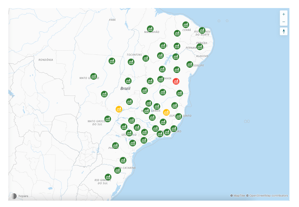
However, this dashboard does not show “the big picture” desired by the FC personnel. Hence, IBBX recently partnered with Hopara to produce a “detail-on-demand” system for the same data. Figure 3 shows FC factories on a map of Brazil color-coded with their facility health.

Notice that there are two factories with a yellow status. If an FC user wants to “drill into” one of them, the user will see Figure 4. Figures 4 and 5 shows greater detail about one yellow sensor in Figure 3, while Figure 6 shows the time series of sensor readings for the sensor in question over five days. Notice that, in a few clicks, a user can move from an overview to the actual time-series data.
FC users appreciate both the analytics dashboard and the Hopara drill-down system. As a result, IBBX and Hopara combined their software into a single system. The takeaway from this example is that there is a need for predictive analytics and insightful visualization. IoT customers should have both kinds of tools in their arsenal.

We now turn our attention to response time. It is accepted pragma that the response time for a command to a visualization system must be less than 500 msec. Since it takes some time to render the screen, the actual time to fetch the data from a storage engine must be less than this number. The next section discusses DBMS performance considerations in more detail.
Behind the Scenes: Powering Real-Time Visualizations Using Timescale


As mentioned previously, these real-time views are powered by TimescaleDB. TimescaleDB is built on top of PostgreSQL and extends it with a series of extremely useful capabilities for this use case, such as automatic partitioning by time, boosted performance for frequently run queries, and continuous aggregates for real-time aggregations.
To guarantee a real-time display, Hopara fetches live data from the database for every user command. Otherwise, stale data will be rendered on the screen. The screenshots above come from a real Hopara application interacting with a database. We note in Figure 2 that the alerting condition is the first one mentioned in a previous section (the latest reading over a threshold).
In other words, the display shows a computation based on the most recent values from the various sensors. Specifically, Hopara uses a database with the schema shown in Figure 7, with a Readings table with all the raw data. This is connected to a Sensor table with the characteristics of each individual sensor.

Then, the display in Figure 2 requires fetching the most recent reading for each sensor. This can be produced by running the following two-step PostgreSQL query:
–— get the latest reading timestamp + sensor_id
SELECT max(timestamp) as timestamp, sensor_id
FROM readings
GROUP BY sensor_id


—— get the reading value
SELECT l.timestamp, l.sensor_id, r.value FROM latest l
INNER JOIN readings r ON r.sensor_id = l.sensor_id AND r.timestamp = l.timestamp
This query, while easy to understand, is not efficient. The following representation leverages PostgreSQL distinct on and Timescale skip scan to perform the query faster, so it is a preferred alternative.
SELECT DISTINCT ON (sensor_id) *
FROM readings
WHERE timestamp > now() - INTERVAL '24 hours'
ORDER BY sensor_id, timestamp DESC;
Note that condition one can be triggered inadvertently, for example, by a worker brushing against the machine. Hence, some combination of conditions 2-4 is a more robust alerting criterion. Unfortunately, these require complex real-time aggregation, which is not present in PostgreSQL. As a result, Hopara switched to TimescaleDB, which extends PostgreSQL with these capabilities (through its continuous aggregate capabilities).
Turn now to Figure 6, which displays five days of data for three sensors. Since each sensor is reporting every 100 msec, there are around 4.5M observations in a five-day window. Obviously, this level of granularity is inappropriate for the display presented. In addition, there is no way to produce the display within the required response time. Hence, Hopara aggregates the raw data into two-minute averages using Timescale’s continuous aggregates (Figure 5 displays these averages).
Timescale’s hypertables automatically partition big tables, so it’s easier for the query planner to localize time-series data. This greatly accelerates queries such as the one required to produce Figure 5, another reason for the switch from PostgreSQL to TimescaleDB.
As a result, Hopara and TimescaleDB are powerful tools for IoT applications of the sort discussed in this blog post.
We want to thank Professor Michael Stonebraker and the team at Hopara for sharing their story on how they are providing meaningful visualization solutions for their customers’ sensor data. As PostgreSQL lovers and enthusiasts, we are incredibly grateful and proud to see Professor Stonebraker using TimescaleDB to provide real-time insights to Hopara’s customers.
If you want to learn more about Timescale and see how we handle time-series data, events, and analytics, read our Developer Q&As. These are real stories from real developers working in the real world. And if you want to try our cloud solution, sign up for a 30-day free trial. You will have access to all its unique features, from continuous aggregations to advanced analytical functions (and you don’t even need a credit card!).
About the Author
Michael Stonebraker is a pioneer of database research and technology. He joined the University of California, Berkeley, as an assistant professor in 1971 and taught in the computer science and EECS departments for 29 years.
While at Berkeley, he developed prototypes for the INGRES relational data management system, the object-relational DBMS, POSTGRES, and the federated system, Mariposa. He is the founder of three successful Silicon Valley startups whose objective was to commercialize these prototypes.
Mike is the author of scores of research papers on database technology, operating systems, and the architecture of system software services. He was awarded the ACM System Software Award in 1992 (for INGRES) and the Turing Award in 2015.
He was elected to the National Academy of Engineering and is presently an adjunct professor of computer science at MIT’s Computer Science and AI Laboratory (CSAIL.)


