Slow Grafana Performance? Learn How to Fix It Using Downsampling
Downsampling in Grafana
Graphs are awesome. They allow us to understand data quicker and easier, highlighting trends that otherwise wouldn’t stand out. And Grafana, the open-source visualization tool, is a fantastic tool for creating graphs, especially for time-series data.
If you have some data that you want to analyze visually, you just hook it up to your Grafana instance, set up your query, and you’re off to the races. (If you’re new to Grafana and Timescale, don’t worry, we’ve got you covered. See our Getting Started with Grafana and TimescaleDB docs or videos to get up and running).
However, while Grafana is an awesome tool for generating graphs, problems still arise when we have too much data. Extremely large datasets can be prohibitively slow to load, leading to frustrated users or, worse, unusable dashboards.
These large time-series datasets are especially common in industries like financial services, the Internet of Things, and observability as data can be relentless, often generated at high rates and volumes.
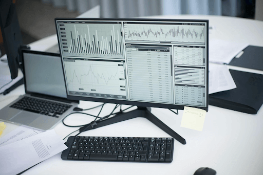
To better understand the problems that can occur when we have extremely large datasets, consider the example of stock ticker data and this graph showing 30 days' worth of trades for five different stocks (AAPL, TSLA, NVDA, MSFT, and AMD):

This graph is composed of five queries which collectively contain nearly 1.3 million data points and takes nearly 20 seconds to load, pan, or zoom!
Even with more manageable amounts of data, our graphs can still sometimes be difficult to interpret if the data is too noisy. If the daily variance of our data is so high, it can hide the underlying trends that we're looking for. Consider this graph showing the volume of taxi trips taken in New York City over a two-month period:

That spike a third of the way in may be a significant shift in volume, and those lower peaks toward the right edge might be a significant decline. It's not immediately obvious though, and certainly, this is not the powerful tool we want our graphs to be.
We can use different types of downsampling to solve the problems of slow-loading Grafana dashboards and noisy graphs, respectively. Downsampling is the practice of replacing a large set of data points with a smaller set.
We’ll implement our solutions using two of TimescaleDB’s hyperfunctions for downsampling, making it easy to manipulate and analyze time-series data with fewer lines of SQL code. We’ll look at one hyperfunction for downsampling using the Largest Triangle Three Buckets or lttb() method, and another for downsampling using the ASAP smoothing algorithm, both of which come pre-installed with Timescale or can be accessed via the timescaledb_toolkit extension if you self-manage your database.
Example 1: Load faster dashboards with lttb( ) downsampling
In our first example, which plots the prices for five stocks over a 30-day period, the problem is that we have way too much data, resulting in a slow-loading graph. This is because the real-time stocks dataset we’re using has upwards of 10,000 points per day for each stock symbol!
Given the timeframe of our analysis (30 days), this is far more data than we need to spot a trend, and the time needed to load this graph is dominated by the cost of fetching all of the data.
To solve this problem, we need to find a way to reduce the number of data points we're getting from our data source. Unfortunately, doing this in a manner that doesn't drastically deform our graph is actually a very tricky problem. For example, let’s look at just the NVDA ticker price:

Here's what we see if we just naively take the 10-minute average for the NVDA symbol (overlaid in yellow on the original data).

The graph of the average (mean) roughly follows the underlying data but completely smooths away almost all of the peaks and valleys, and those are the most interesting parts of the dataset! Taking the first or last point from each bucket results in an even more skewed graph, as the outlying points have no weight unless they happen to fall in just the right spot.
What we need is a way to capture the most interesting point from each bucket. To do that, we can use the lttb() algorithm which gives us a downsampled graph that follows the pattern of the original graph quite closely. (As an aside, lttb() was invented by Sveinn Steinarsson in his master’s thesis).

Using lttb(), the downsampled data is barely distinguishable from the original, despite having less than 0.5 % of the points!
lttb() works by keeping the same first and last point as the original data but dividing the rest of the data into equal intervals. For each interval, it then tries to find the most impactful point. It does this by building a triangle for each point in the interval with the point selected from the previous interval and the average of the points in the next interval. These triangles are compared with one another by area. The largest resulting triangle corresponds to the point in the interval that has the largest impact on how the graph looks.
As we see above, the result is a graph that very closely resembles the original graph. What's not as obvious is that the raw data was nearly 315,000 rows of data that took over five seconds to pull into our dashboard. The lttb() data was 1,404 rows that took less than one second to fetch.
Here is the SQL query we used in our Grafana panel to get the lttb() data.
SELECT
  time AS "time",
  value AS "NVDA lttb"
FROM unnest((
    SELECT lttb(time, price, 2 * (($__to - $__from) / $__interval_ms)::int)
    FROM stocks_real_time
    WHERE symbol = 'NVDA' AND $__timeFilter("time"))
)
  ORDER BY 1;
As you can see, the real work here is done by the lttb() hyperfunction call in the inner SELECT. This function takes the time and value columns from our table, and also a third integer specifying the target resolution, which is the number of points it should return.
Unfortunately, Grafana doesn't directly expose the panel width in pixels to us, but we can get an approximation from the $__interval global variable (which is approximately (to - from) / resolution). For this graph, the interval was a bit of an underestimation, hence us doubling it in the function above.
Our lttb() hyperfunction returns a custom timevector object, which uses unnest to get time, value rows that Grafana can understand and plot.
Example 2: Find signal from noisy datasets with ASAP smoothing downsampling
lttb() is a fantastic downsampling algorithm for giving us a subset of points that maintain the visual appearance of a graph. However, sometimes the problem is that the original graph is so noisy that the long-term trends we're trying to see are lost in the normal periodic variance of the data. This is the case we saw in our second example above, that of taxi data (and shown below):

In this case, what we're interested in isn't a way of just reducing the number of points in a graph (as we saw before, that ends up with a graph that looks the same!), but doing so in a manner that smooths away the noise.
We can use a downsampling technique called Automated Smoothing for Attention Prioritization (ASAP), which was developed by Kexin Rong and Peter Bailis.
ASAP works by analyzing the data for intervals of high autocorrelation. Think of this as finding the size of the repeating shape of a graph, so maybe 24 hours for our taxi data, or even 168 hours (one week). Once ASAP has found the range with the highest autocorrelation, it will smooth out the data by computing a rolling average using that range as the window size.
For instance, if you have perfectly regular data, ASAP should mostly smooth everything away to the underlying flat trend, as in the following example:

The green line here is the raw data. It is generated as a sine wave with an interval of 20 and an offset of 100 that repeats daily. The yellow line is the ASAP algorithm applied to the data, showing that the graph is entirely regular noise with no interesting underlying fluctuation.
Obviously ASAP can work well on this type of synthetic data, but let's see how it does with our taxi data.

Here it becomes very obvious that there was a significant dip over from about 11/26 to 12/03, which happens to be Thanksgiving weekend, a US public holiday weekend that occurs at the end of November every year. We can see this even more dramatically by selecting only the ASAP output and letting Grafana auto-adjust the scale:

The data for this graph is the taxi trips CSV file. The SQL query we're running in Grafana is this:
SELECT
  time AS "time",
  value AS "asap"
FROM unnest((
  SELECT asap_smooth(time, value, (($__to - $__from) / '$__interval_ms')::integer)
  FROM taxidata
  WHERE $__timeFilter("time"))
)
ORDER BY 1
As in example 1 above, the asap_smooth hyperfunction does most of the work here, taking the time and value columns, as well as a target resolution as arguments. We use the same trick from example 1 to approximate the panel width from Grafana's global variables.
Learn More
Eager to try downsampling or learn more about other hyperfunctions? Check out our downsample and hyperfunctions docs for more information on how hyperfunctions can help you efficiently query and analyze your data.
Looking for more Grafana guides? Here are our Grafana tutorials and our Grafana 101 Creating Awesome Visualizations for more support on visualizations in Grafana.
If you need a database to store your time-series data and power your dashboards, try Timescale, our fast, easy-to-use, and reliable cloud-native data platform for time series built on PostgreSQL. (You can sign up for a 30-day free trial, no credit card required.)