Data Visualization Examples: How to Create Pie Charts in Grafana

There are numerous data visualization examples in the glorious world of the Internet, but today we’re focusing on a good old classic sitting quietly in almost every data visualization dashboard: the pie chart.
Pie charts are mostly used when dealing with group or categorized data. As the name suggests, the pie-shaped chart represents the whole data, divided into multiple parts or slices. Each piece of the pie represents a subcategory of the complete data.
Pie charts can answer several questions:
- Which was the least traded stock volume last month?
- Which stock has the highest traded stock today?
- Who had the highest percentage of accrued votes in the last election?
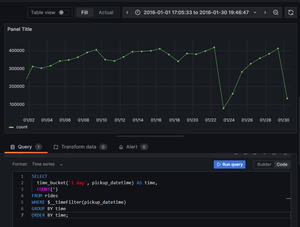
In this tutorial, you’ll learn what pie charts are and how to use them in the open-source analytics and interactive visualization web application Grafana—using PostgreSQL and TimescaleDB.
Using a real-world stocks dataset, you’ll find a handful of data visualization examples on creating beautiful and insightful pie charts in Grafana (with just SQL!). We’ll cover creating pie and donut charts with pre-aggregated data using arbitrary time intervals (time_bucket) and show the transaction volume—all in the same panel.
Join us along for the ride!
Looking for more Grafana guides? Here are our Grafana tutorials and our Grafana 101 Creating Awesome Visualizations for more support on visualizations in Grafana.
If you need a database to store your time-series data and power your dashboards, try Timescale, our fast, easy-to-use, and reliable cloud-native data platform for time series built on PostgreSQL. (You can sign up for a 30-day free trial, no credit card required.)